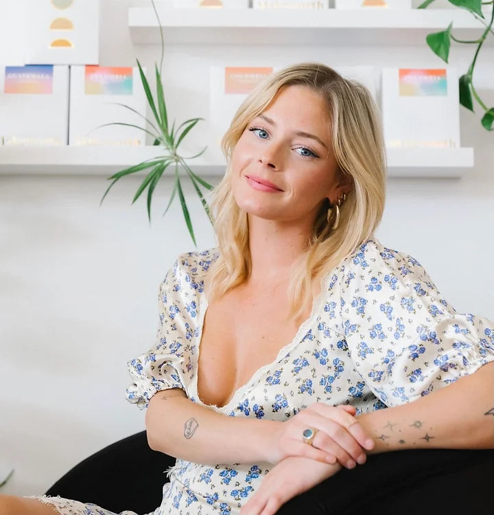
A Makeworth staff member since 2020, Kylee Weatherill is a phenomenal barista and graphic designer. Kylee has created beautiful bags, stickers, merch, and most recently designed Makeworth Coffee's gorgeous sunrise-inspired coffee boxes. We wanted to sit down with her and hear a little more about her graphic design story and inspirations, as well as the process of creating the sunrise box!
______
Lauren: What’s your story with graphic design? What drew you to it, and what keeps you creating?Kylee: I knew I wanted to pursue something creative. I have always really, really loved visual design, and I thought I wanted to be a fashion designer for a long time, since I was a little kid. I got a sewing machine in fourth grade for Christmas, and I would sew my own stuff and wear my designs to school.
Lauren: Did you have a portfolio when you applied?
Kylee: I made one for my application. I had some ideation sketches from FIDM and some geometric renderings I put in there. [In the application] they give you a typography assignment. I truly think with most jobs, it’s not necessarily whether or not you’re able to do them, it’s whether or not someone is willing to teach you to do them. Most people can do anything, they’re just not taught
Lauren: What or who inspires you?
Kylee: Definitely movies. I really get fully immersed in movies, my whole brain is like, “I am in this world of this movie”. I get obsessed.
Lauren: Yeah. I feel like they stick with you too, you’ve come to work and you talk about a movie you’ve seen, you care a lot. You’re a really passionate person, it’s really cool.
Lauren: How did you come up with the sunrise design?
Kylee: When we made this packaging, we wanted to pay homage to the idea of a “new day”. We all sat and talked about ways we could represent a sunrise, but at the same time not make it so direct. I like that on the package it could represent a sunrise or a sunset. It’s kind of a full circle thing, the idea that a day is just a day, and what you do with that can be different for each day. I came in with three really drastically different mood boards. There was a really floral, delicate, crafted mood board, a full gradient mood board, and a full, city mood board. Everyone was really into the gradient.
Kylee: Yeah, but those gradients were darker, and that’s not Makeworth at all. So then we were talking about gold foil — that was something that paid homage to the original Makeworth concept; it was very gold and black and pink. We wanted to maintain some sense of that originality because we were shifting into roasting, and that status didn’t mean we were totally throwing [the aesthetic] away — we were just evolving, but still wanted to maintain it. We wanted to create something that would fit in our [cafe] space, but also be able to transcend the cafe. Tim brought out putting cut-outs in the box and creating an insert card with the importer and roast information. We needed something interchangeable because our coffees change so frequently. We just liked the idea of the sunrise gradient being on the insert and seen through the cut-out. We wanted to create something that represents us, and I think it did. It can be sunset and sunrise — just to know that when this day ends, it’s a new day tomorrow, and you did it. You made it!
Thanks so much to Kylee for participating in this interview — her creativity, passion, and wonderful personality come through in her work. Shop her designs on our coffee boxes today!


